Nook — Mobile Commerce
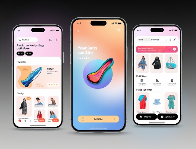
A mobile-first storefront concept built around fast browsing, clear product stories and a frictionless path to checkout.
01 — Context
The challenge
Nook is a mobile commerce concept that treats the phone as the primary shopping surface. Instead of compressing a desktop catalogue into a smaller screen, the experience is organised around short, tactile product moments and a checkout that never loses context.
Mobile shoppers abandon when a storefront feels slow, crowded or uncertain. The brief was to explore a shopping flow that feels calm and quick at the same time: easy to browse, easy to understand, and easy to finish.
02 — Approach
The solution
The concept uses a small set of strong product cards, sticky context for the current category, and a checkout that keeps the order summary visible without taking over the screen. Skeleton states and optimistic interactions keep the experience responsive on slower connections.
03 — Build
What I built
Editorial product cards
A flexible card system for products, collections and seasonal edits.
Quick-add flow
Size and colour selection without leaving the browsing context.
Calm checkout
A short, focused flow with a persistent order summary.
Resilient states
Skeletons, retries and helpful empty states instead of blank screens.
04 — Result
What the build demonstrates
- A browsing flow that works comfortably with one hand.
- Product cards with room for material, fit and price context.
- A persistent checkout summary that reduces uncertainty.
- Clear loading, empty and error states at every step.
“Mobile commerce is mostly a rhythm problem. The interface needs to move quickly, but every transition still needs to tell the shopper what just happened and what comes next.”
Project reflection
Next step
Have a project like this in mind?
Tell me what you're trying to make. I'll reply with an honest view of the work and the next useful step.